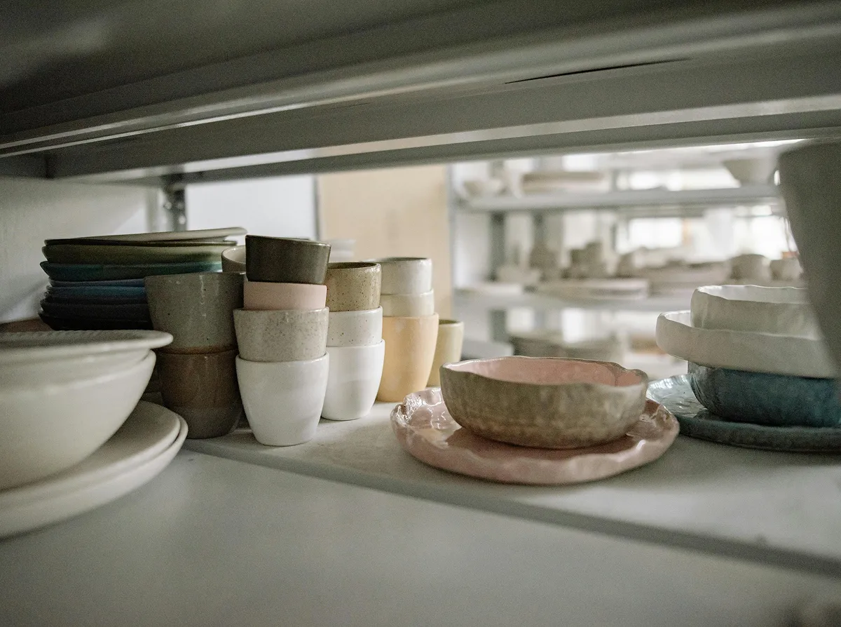
Warm neutrals have quietly become the new kitchen white. They feel like sunlight on plaster, like linen pulled off the line, like a room that has always been there. The best palettes are never about a single color — they’re a careful conversation between tone, undertone, and texture, layered until the whole room reads as one calm idea.
A cohesive palette isn’t a list of paint chips — it’s a system. You start with a base, add a deeper anchor, and finish with a few honest accents pulled from natural materials. The aim is balance and consistency, where every shade feels like it belongs to the same family. It’s less about matching and more about quiet agreement…
- Cream & Soft Bone for the Walls
- Oat & Mushroom for Cabinetry
- Warm Stone & Limewash Surfaces
- Aged Brass & Brushed Bronze for Hardware
- Walnut, Oak, and Honey-Toned Woods
- And One Quiet Accent — sage, ochre, or rust 🙂
Our House Palette
Our house palette is the result of years of testing under every kind of light. We pair a warm bone wall for softness, a deeper mushroom cabinet for grounding, and aged-brass hardware for the small glow that pulls everything together. It’s designed to read beautifully at breakfast, at golden hour, and under the kitchen pendants when you’re cooking late.
A great palette is like a great team — each tone covers the weaknesses of the others, and together they achieve something none could alone.
Athena Calderone, Author and Designer
We revisit the palette every few seasons as the natural light shifts. Some pieces get swapped for warmer or cooler variants; others stay fixed as the anchors. It’s an ongoing craft, not a fixed recipe — and that’s what keeps the kitchen feeling alive instead of styled.
Choosing the Right Palette
If you’re new to designing with neutrals, start with three tones in the same family — they strike the perfect balance between depth and quiet. If your kitchen gets a lot of cool northern light, lean toward warmer creams and oats; in southern light, you can afford slightly cooler greys without going cold. And if you like to experiment, swap your accent twice a year — a single dark green vase in winter, terracotta come summer.

All of our recommended palettes are available as sample boards in the studio — real swatches, real materials, photographed in real kitchen light. Bring a piece of your own home and we’ll layer it in to see how everything sits together.
Takeaway
The right palette can transform your kitchen. Stop in, talk to our team, and let us help you find the one that fits your light, your taste, and your life. We love nothing more than matching the right tones to the right home.
Leave a Reply